Websites That Look Perfect On Every Screen
We design and develop pixel-perfect, lightning-fast responsive websites that deliver flawless experiences on desktops, tablets, and smartphones — because 63% of your visitors are on mobile right now.
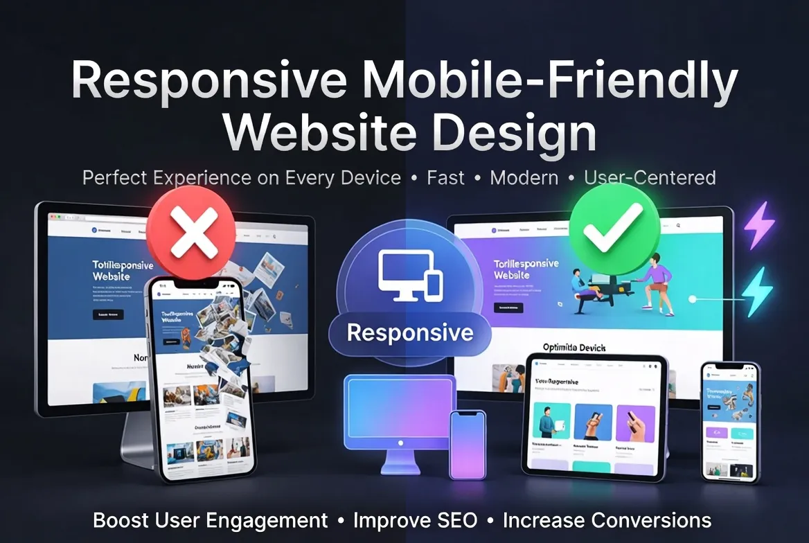
Responsive Design That
Converts on Every Device
Responsive web design is no longer optional — it’s the baseline expectation for every visitor who lands on your site. With over 63% of global web traffic now coming from mobile devices, a website that doesn’t adapt fluidly to every screen size is actively losing you customers, leads, and revenue every single day.
Our responsive website design service goes far beyond simply shrinking your desktop layout onto a phone screen. We build mobile-first, fluid layouts using CSS Grid, Flexbox, and advanced media query architecture — ensuring your site doesn’t just “work” on mobile, but delivers a genuinely premium, friction-free experience regardless of device, browser, or screen orientation.
Google’s mobile-first indexing means the mobile version of your site is the primary version Google evaluates for search rankings. A poorly optimized mobile experience directly suppresses your organic visibility. Our designs are engineered with Core Web Vitals, Google’s mobile usability guidelines, and PageSpeed scores as foundational requirements — not afterthoughts.
From touch-friendly navigation and thumb-zone optimized CTAs to adaptive typography, responsive images, and cross-browser compatibility testing across 30+ device/browser combinations — every element of your site is crafted to perform beautifully and convert effectively at every breakpoint.
- ✓ Mobile-first CSS architecture built for Google’s indexing priority
- ✓ Fluid grid layouts adapting seamlessly across all breakpoints
- ✓ Touch-optimized navigation, buttons, and interactive elements
- ✓ Responsive images with srcset and lazy loading for fast mobile loads
- ✓ Cross-browser testing: Chrome, Safari, Firefox, Edge on iOS & Android
- ✓ Core Web Vitals optimization (LCP, FID, CLS) across all devices
- ✓ Typography scaling with fluid clamp() functions for perfect readability
- ✓ Hamburger menus, off-canvas nav, and sticky headers for mobile UX
Everything Included in
Our Design Service
Nine core deliverables — every layer of responsive design handled by our expert team.
Mobile-First Layout Architecture
We design from the smallest screen up — not the other way around. Mobile-first CSS with strategic breakpoints at 480px, 768px, 1024px, and 1280px ensures every layout adapts gracefully without hacky overrides.
FoundationFluid Typography System
Headlines and body text that scale fluidly between breakpoints using CSS clamp() — eliminating jarring text size jumps and ensuring perfect readability from a 320px iPhone SE to a 4K monitor.
TypographyTouch-Optimized UI Components
Buttons sized to 44×44px minimum touch targets, swipe-enabled carousels, thumb-zone CTAs, and touch-friendly form inputs — eliminating the frustrating tap misses that kill mobile conversions.
Mobile UXResponsive Navigation Design
Hamburger menus, off-canvas slide navigation, mega menus that collapse cleanly, and sticky headers with scroll-aware behavior — ensuring visitors can navigate effortlessly on any device.
NavigationResponsive Image Implementation
Every image uses srcset and sizes attributes for device-appropriate resolution serving, combined with lazy loading and WebP format — dramatically reducing data usage and improving LCP scores on mobile.
PerformanceCross-Browser Compatibility
Exhaustive testing across Chrome, Safari, Firefox, Edge, Samsung Internet, and Opera on iOS and Android devices — ensuring your site looks and works identically for every visitor, everywhere.
QA TestingCore Web Vitals Optimization
LCP under 2.5s, CLS under 0.1, and FID under 100ms across mobile and desktop — engineered from day one, not bolted on at the end, to meet Google’s performance ranking thresholds.
SEO PerformanceResponsive Forms & CTAs
Contact forms, lead capture forms, checkout flows, and call-to-action sections rebuilt for mobile conversion — with native input types, auto-fill support, and tap-to-call/email functionality.
ConversionGoogle Mobile Usability Audit
Full Google Search Console mobile usability report delivered post-launch — confirming zero mobile usability errors and providing a baseline for ongoing mobile SEO monitoring.
ReportingWhy Mobile-Friendly Design
Is Non-Negotiable in 2025
The numbers make the business case impossible to ignore. Here’s what’s at stake.
Mobile Web Traffic
Nearly two-thirds of all global website visits now come from smartphones and tablets — more than double desktop’s share.
Google’s Priority
Google uses mobile-first indexing for 100% of websites — meaning your mobile site determines your search rankings, not desktop.
Conversion Lift
Properly optimized mobile sites see up to 74% higher conversion rates than non-optimized equivalents in A/B tests.
The Speed Threshold
53% of mobile users abandon a page that takes longer than 3 seconds to load — speed directly impacts revenue on mobile.
Choose Your
Design Package
Flat-rate packages with zero hidden costs. All include mobile-first responsive design and cross-device testing.
- 1 Fully Responsive Page
- Mobile-First Design
- 3 Breakpoints (Mobile/Tablet/Desktop)
- Touch-Optimized UI
- Responsive Hero Section
- Contact Form
- Cross-Browser Testing
- Google Mobile Usability Pass
- HTML/CSS/JS Delivery
- 5–7 Days Delivery
- 2 Revisions
- Email Support
- Up to 8 Responsive Pages
- Mobile-First Architecture
- 5 Breakpoints (All Devices)
- Custom Responsive Navigation
- Fluid Typography System
- Responsive Image Implementation
- Core Web Vitals Optimization
- Touch-Optimized Forms & CTAs
- Cross-Browser & Device Testing
- Google Mobile Usability Audit
- PageSpeed Score Report
- 10–14 Days Delivery
- 5 Revisions
- Priority Support
- Unlimited Pages
- Advanced Mobile-First System
- Custom Design System & Components
- Advanced Responsive Navigation
- Animated Micro-interactions
- E-commerce Responsive UI
- Performance Budget Enforcement
- Accessibility (WCAG 2.1 AA)
- 30+ Device/Browser Combinations
- Google Search Console Integration
- White-Label Delivery Option
- Dedicated Project Manager
- 14–21 Days Delivery
- Unlimited Revisions
How We Build Your
Responsive Site
Discovery & Brief
We gather your brand guidelines, target audience, competitor references, and content requirements. We clarify goals and define success metrics before a pixel is designed.
Mobile Wireframes
We start every project with mobile wireframes — mapping the information hierarchy, navigation structure, and user flows at 375px before scaling up to wider screens.
Visual Design
High-fidelity mockups at three key breakpoints (mobile, tablet, desktop) are created and shared for your review and approval before any code is written.
Development & Testing
Clean, semantic HTML/CSS/JS is written mobile-first. We test across 20+ real device and browser combinations, fixing every responsiveness issue before delivery.
QA & Handover
Final Google Mobile Usability and PageSpeed audits are completed. All source files, assets, and documentation are packaged and delivered with a full briefing call.
Frequently Asked
Questions
A responsive website uses fluid layouts, flexible images, and CSS media queries to automatically adapt its design to any screen size — from a 320px smartphone to a 4K desktop monitor. “Mobile-friendly” is Google’s term for sites that meet its mobile usability criteria: no small text, no horizontal scrolling, touch targets are large enough, and content fits within the viewport without zooming. Our designs achieve both: they’re fully responsive AND pass Google’s mobile-friendly test with zero issues.
Mobile-first design means starting the design and development process with the smallest screen — typically a 375px smartphone — and progressively enhancing the layout for larger screens. This approach is superior because: it forces ruthless prioritization of content and features that matter most, it aligns with how Google indexes and evaluates your site, it results in leaner CSS code, and it ensures the experience is excellent on the device most of your visitors actually use. Traditional “desktop-first then shrink” approaches produce cramped, compromised mobile experiences.
We test across a comprehensive matrix of real devices and browsers. On mobile: iPhone SE, iPhone 14 Pro, Samsung Galaxy S23, Google Pixel 7, and various mid-range Android devices — on Safari, Chrome for iOS, Chrome for Android, Firefox for Android, and Samsung Internet. On tablet: iPad Air, iPad Pro, and Samsung Galaxy Tab. On desktop: Chrome, Firefox, Safari, Edge, and Opera at 1280px, 1440px, and 1920px. For Enterprise packages, we extend to 30+ combinations including older device simulation for maximum compatibility.
We do both. If you already have a desktop website that isn’t mobile-friendly, we can retrofit responsive design into your existing codebase — rewriting the CSS architecture, implementing media queries, refactoring layouts, and adding mobile-specific UX improvements without rebuilding the entire site. This is typically faster and more cost-effective than a full rebuild. We’ll audit your existing site first and provide a specific quote for the retrofit work required based on its complexity.
We deliver clean, standards-compliant HTML5, CSS3, and JavaScript files that can be integrated into any platform or CMS — including WordPress, Webflow, Shopify, or a custom backend. If you’re on WordPress, we can convert the responsive design into a custom theme. For Webflow projects, we design and build directly in Webflow. All source files, assets, fonts, and documentation are included. We also provide a handover call walking you through the codebase and how to make basic content updates yourself.
Yes — directly and measurably. Google has used mobile-first indexing since 2024, meaning your mobile site’s performance determines your search rankings across all devices. A mobile-unfriendly site receives a “Not mobile-friendly” signal that actively suppresses rankings. Beyond the binary pass/fail, Core Web Vitals scores (which our designs are engineered to pass) are confirmed ranking signals — better LCP, CLS, and FID scores correlate with higher positions. Our clients typically see measurable organic ranking improvements within 4–8 weeks of launching a properly optimized responsive design.
Revision rounds depend on your package: Starter includes 2 rounds, Professional includes 5, and Enterprise includes unlimited revisions. Each revision round involves you reviewing the current design, consolidating all feedback into one document, and us implementing all changes in a single round. We use Figma or a staging URL for design review, making it easy to leave precise comments on specific elements. We’ve found 2–3 focused revision rounds are sufficient for most projects when clients provide consolidated, clear feedback.
Ready for a Website That
Works on Every Screen?
Join hundreds of businesses that have transformed their mobile presence with our responsive design service. Get a free consultation and quote today.
Are you ready to purchase the product?
Regular Price: $550 USD
Discount Price $250 USD
We focus on creating a natural backlink profile using diversified link sources. Each backlink is built carefully to ensure it passes real SEO value and strengthens your website’s credibility.
Buyer Review

Rabi Shing
Proven SEO Agency did an outstanding job. She was professional, polite, and very quick to respond. Delivered 100 citations exactly as promised clean, organized, and no duplicates. You can tell she knows her stuff and thinks strategically about local SEO.

siaukia400767
Excellent communication with Proven SEO Agency Team, I highly recommend and will be using in the future for all of my projects. highly rated and excellent work delivery

Adam Smith
Amazing work! I’m really satisfied with how quickly and accurately you handled everything. Delivered before deadline too—great job. I’ll surely come back for more projects. Thanks a lot!

Adeel Najam
Wow, I’m truly impressed! Proven SEO Agency work was fast, precise, and exceeded my expectations. Thanks for the excellent job. You even delivered earlier than promised. Keep it up, bro—I’ll definitely hire you again!
Important Links
© 2023 Company Name. All Rights Reserved. Designed By Proven SEO Agency